Derek
Watson

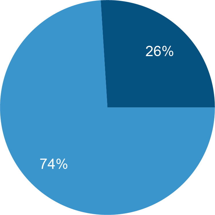
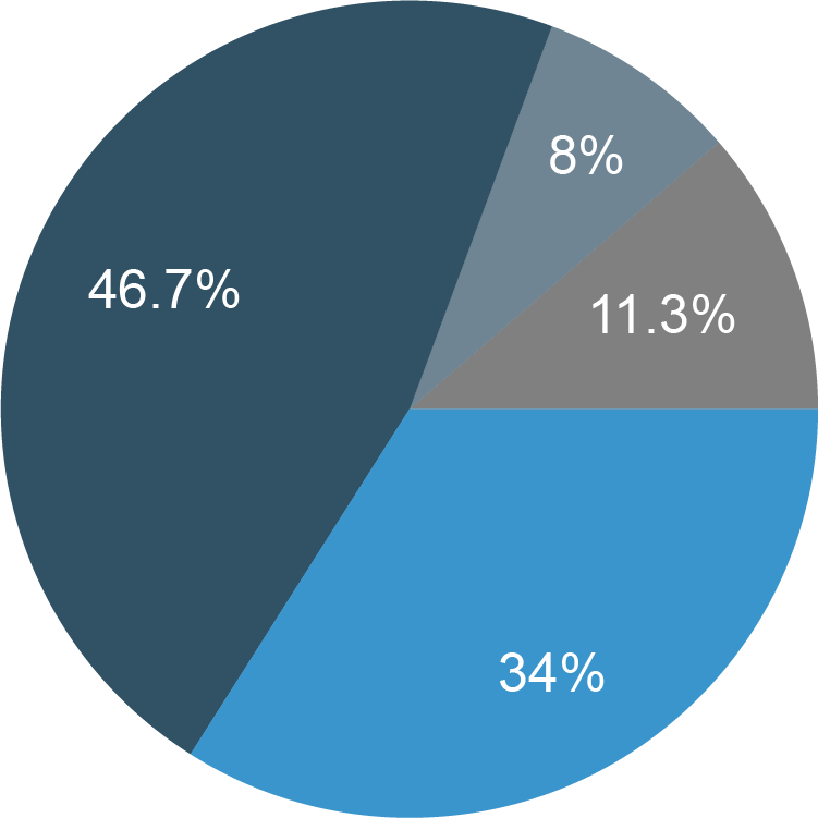
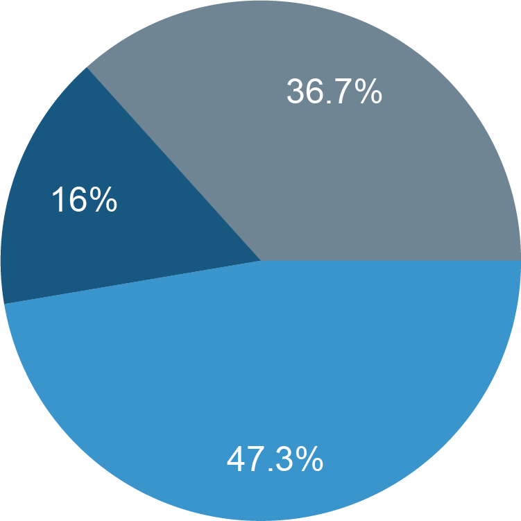
The team began user research with an online survey aimed at informing us about demographics and getting a general sense of how our cross-sample felt about both Venmo and donating online.
What we discovered is that the User base was both diverse in age and were mostly open to donating online. Further, we found validation that the new feature would be a welcomed addition.
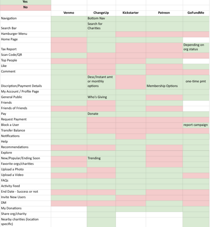
We knew the were other sites focused solely on giving and wanted to understand what they were doing right and how our feature would offer a competitive advantage similar features existed was a no-brainer.
We felt that understanding the sector more in depth would be invaluable to us as we moved forward with the project.
In the allotted timeline we were able to conduct four interviews with Users who rated themselves as moderately to highly familiar with the app based on frequency of use.From this qualitative data we took away enough of an idea to move forward with personas. What follows are some of the frustrations that were found:
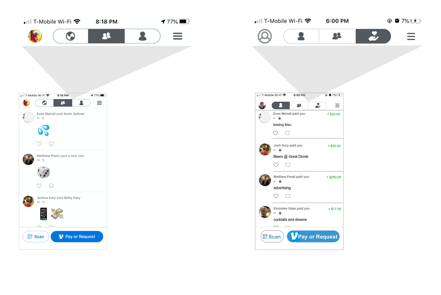
As we asked Users to explore the app with a critical eye we found one of our own questions resounding more than once: Who are all of the people and transactions in my global feed and why does Venmo facilitate "Sugar Daddies" soliciting for (mainly) girls to "take care of"?
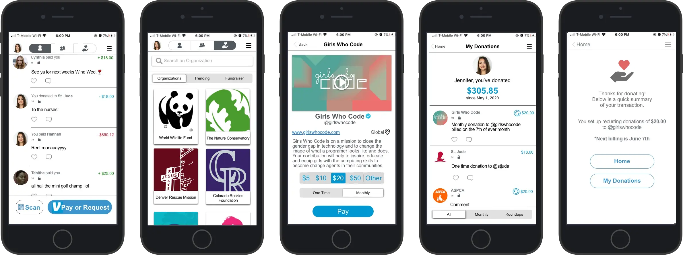
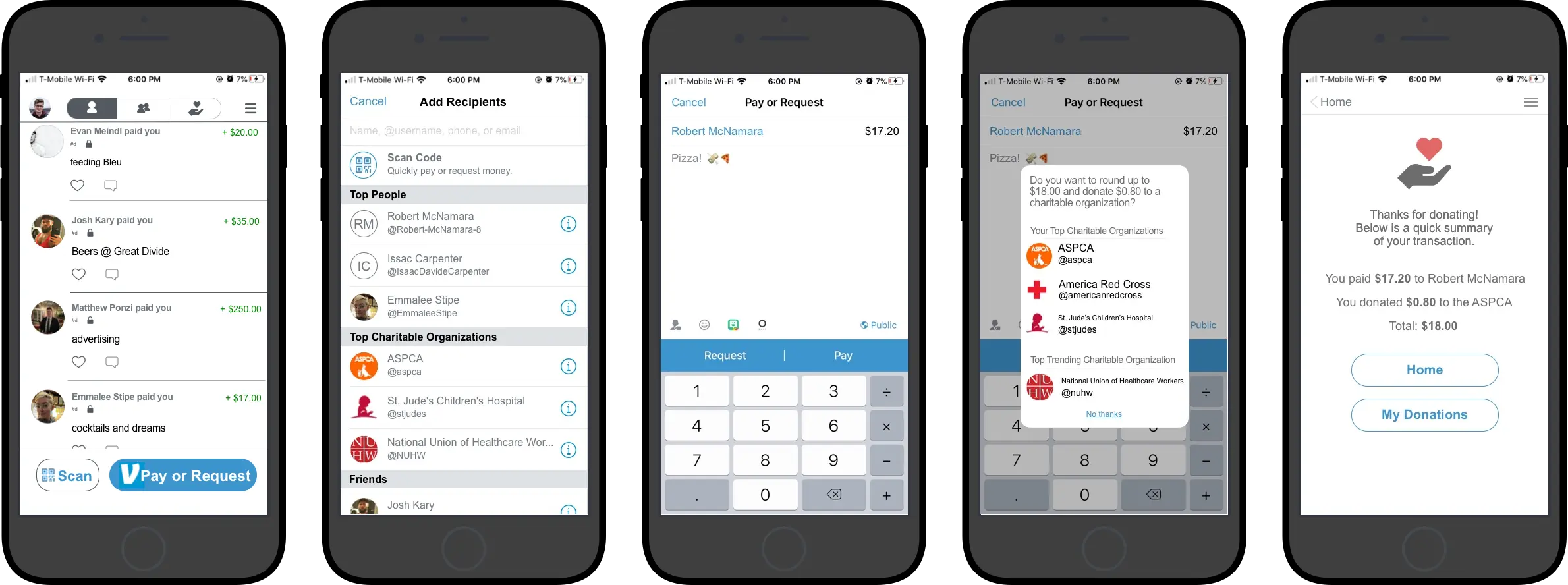
Well, we had no good answer for that question but we did recognize the opportunity to replace the Global Feed icon with a far more useful one: our own Donations icon.
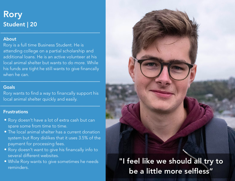
After sufficient research understanding our user base we moved on building personas to have archetypes we could create User Flows around. We determined that two distinct personas would be adequate to illustrate how the feature addition would work.
We created Rory and Jennifer to represent the Users we intended to design for.
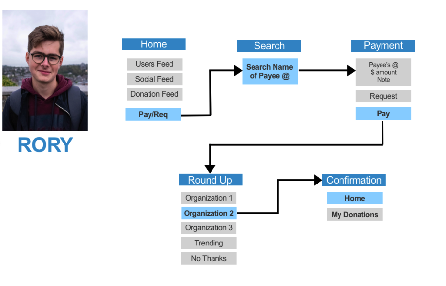
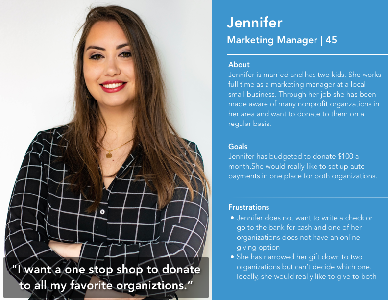
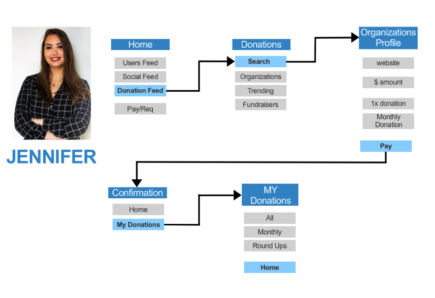
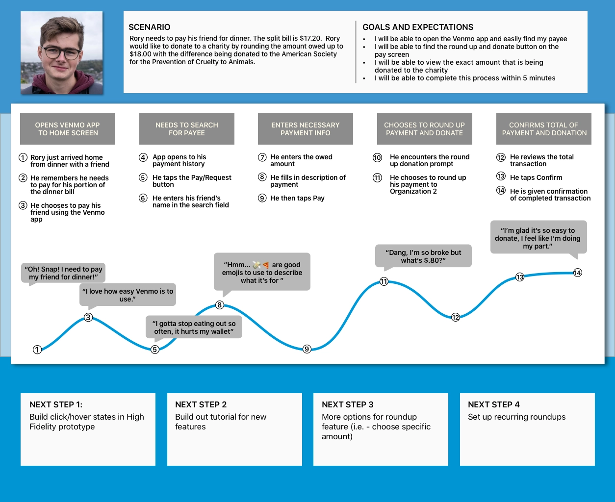
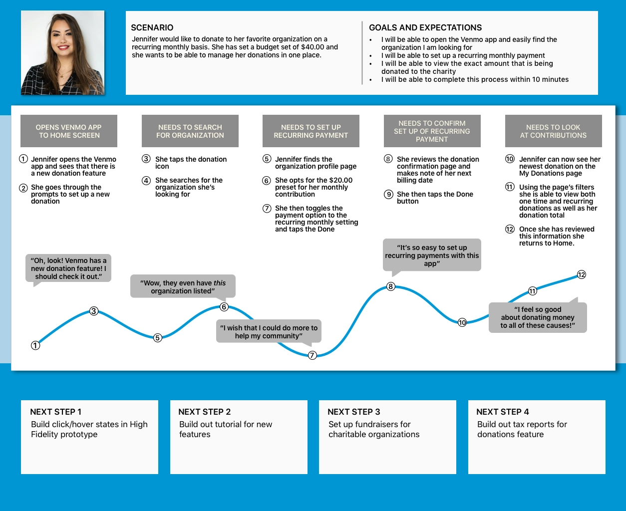
The team felt that Journey Mapping would be a good way yo build and keep empathy at the center of our User Flows and decisions.
We hypothesized that if cognitive load was kept to a minimum then we could decrease that chance our feature would result in a negative emotional impact, and thereby increase chances of a favorable response.
Charity, on the individual level, is often a matter of mood and ease rather than an imperative.
The following Journey Maps were one of my largest contributions to the project.
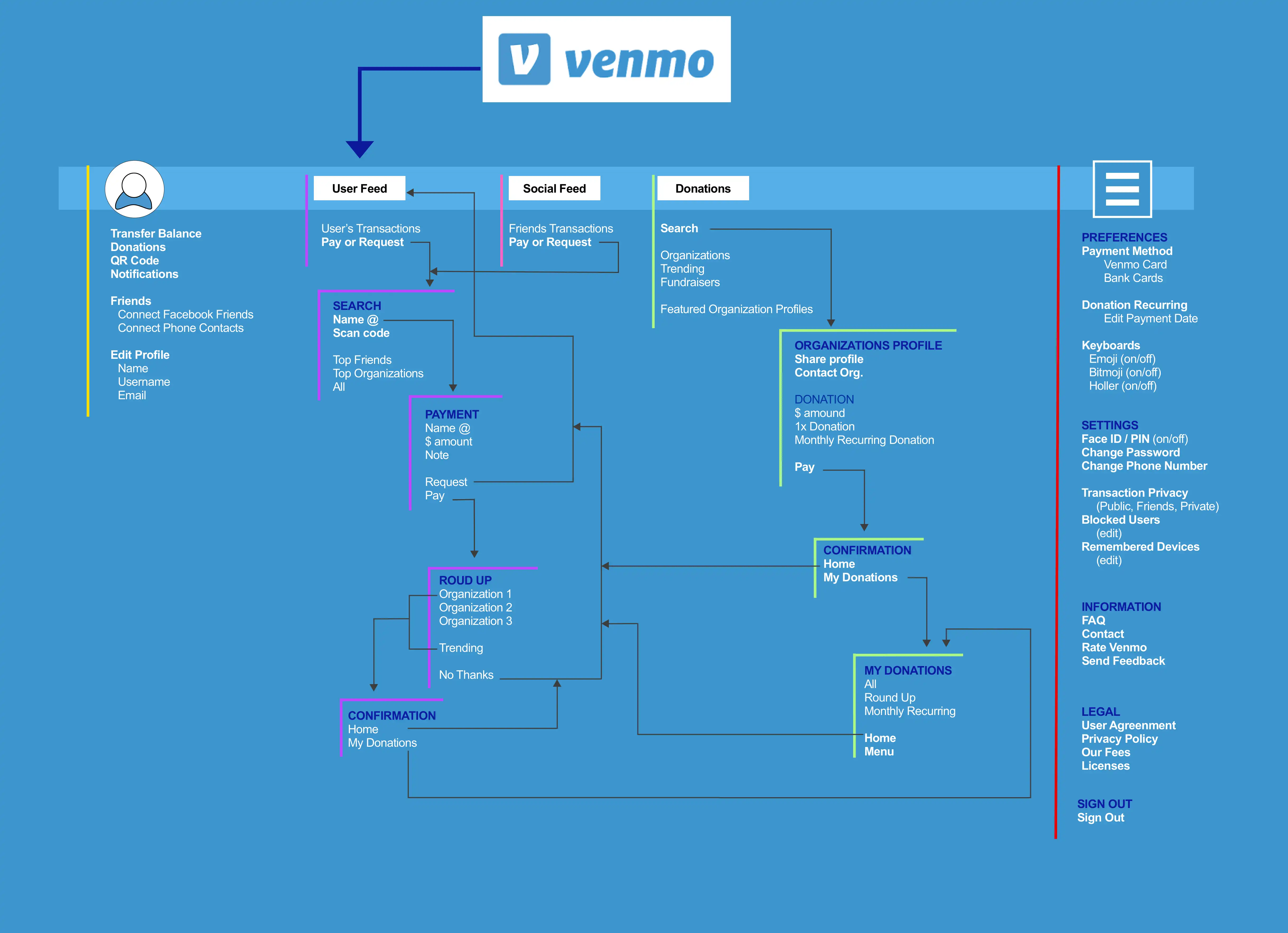
The team analyzed Venmo’s app in depth to figure out where we could best add the new features into the existing flow.
An app map was generated so that we could better visualize where in the app’s IA our new features should be integrated.
The Top-Level Donations tab illustrates where that category fits into the existing archittecture.